
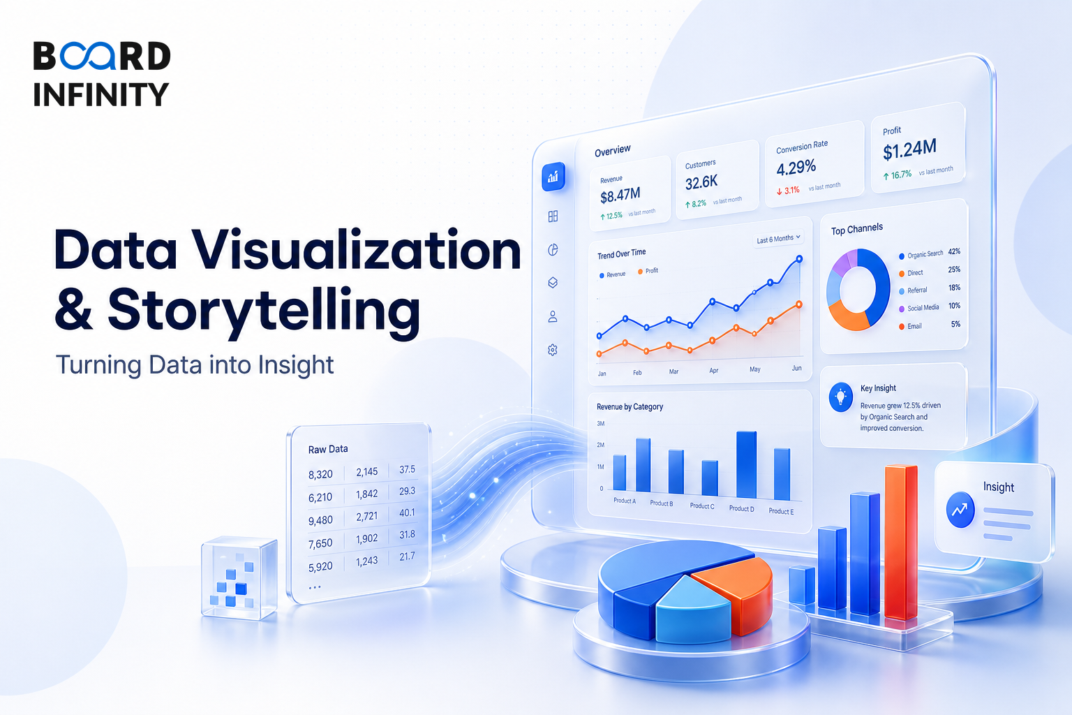
Data Visualization & Storytelling: Turning Data into Insight is a structured track of 6 lessons that build a complete, interview-ready understanding of the topic. Work through them in order, then use the quiz and flashcards in each lesson to revise.
What this course covers
- Principles of Effective Data Visualization - The Data Storytelling Triad Data (the facts) + Narrative (the 'so what') + Visuals (the medium) = Data Story A chart without narrative is just decoration.
- Chart Makeover: Before vs After Examples - Bad Chart: 3D exploded pie chart, 8 slices, rainbow colours, no labels, title says 'Sales by Region' - tells you nothing about what to do.
- The Chart Selection Guide: Which Chart to Use When - Interview Favourite: 'What chart would you use for X?' - always tie your chart choice to the analytical question Question Type Best Chart When to Use Avoid When Indian Ex
- Tableau Fundamentals for Analysts - Tableau Architecture Flow Data Source DB, CSV, API → Data Engine Hyper Extract → VizQL Engine Visual Query Language → Visualization Marks, Shelves → Dashboard Actions, Fi
- Power BI Fundamentals for Analysts - Power Query ETL & Data Prep → Data Model Relationships & Schema → DAX Engine Calculations & KPIs → Visuals Charts & Reports → Power BI Service Cloud Sharing & Collaborati
- Data Storytelling: How to Communicate Insights Effectively - The Pyramid Principle (McKinsey / Barbara Minto) Ch 5: Data Visualisation & Storytelling Lead with the conclusion, then support it.