
Visualisation in Python: Matplotlib, Seaborn & Plotly
If the same sales dataset can “prove” that a product is growing and also that it is failing, is the data wrong - or is the chart misleading you? A line chart may reveal seasonality, a bar chart may expose regional gaps, and an interactive dashboard may let a manager find the one market hiding the truth.
- Matplotlib is best for precise, static, publication-style charts where you want full control over every element.
- Seaborn is best for fast statistical exploration - distributions, relationships, categories and heatmaps from pandas DataFrames.
- Plotly is best for interactive business storytelling - hover, zoom, filters, maps and dashboards.
- Start with the business question, not the library: compare, trend, distribution, relationship, composition or geography.
- A good chart has one clear message, correct encoding, labelled axes, honest scale and minimal decoration.
- For interviews, explain the trade-off: Matplotlib gives control, Seaborn gives speed and statistical clarity, Plotly gives interactivity.
- The most common mistake is listing libraries without saying when and why you would choose each.
The Big Picture: Visualisation Turns Data Into a Decision
Python visualisation is not about making charts look attractive. It is a decision pipeline: a business question becomes cleaned data, the right library creates the right visual, and the visual changes what a manager does next.
Core Explanation: What Each Python Visualisation Library Is Really For
Think of the three libraries as three levels of the same skill. Matplotlib is the engine, Seaborn is the statistical shortcut, and Plotly is the interactive layer.
A sharp MBA answer should not sound like a software manual. It should sound like this: “If I am exploring whether discount depth affects order value, I may use Seaborn scatter or regression plots. If I need to present the final insight in a static report, I may refine it in Matplotlib. If a regional manager needs to drill down city-wise, I would use Plotly.”
How to Choose the Right Chart Before Choosing the Library
The strongest analysts do not ask, “Should I use Seaborn or Plotly?” first. They ask, “What relationship am I trying to reveal?” Once that is clear, the library choice becomes obvious.
The Practical Python Visualisation Workflow
Use this sequence whenever you describe how you would build a chart from a raw dataset.
Quality Checks: How to Judge Whether a Visualisation Works
A chart is successful only if it improves understanding. These practical metrics are useful for dashboards, analytics projects and interview answers. Treat the ranges as business usability benchmarks, not universal laws.
Definitions You Can Say in One Breath
- Data visualisation: Graphical encoding of data into position, length, colour, shape or motion to reveal patterns and exceptions.
- Matplotlib: Python’s foundational plotting library for precise, static charts and low-level visual control.
- Seaborn: A high-level statistical visualisation library built on Matplotlib and designed to work smoothly with pandas DataFrames.
- Plotly: An interactive graphing library for browser-based charts, dashboards, hover effects, zooming and drill-down analytics.
- EDA: Exploratory data analysis means using summaries and visuals to understand data quality, patterns, outliers and relationships.
Case Study: PhonePe Pulse and the Power of Interactive Data Storytelling
PhonePe Pulse made large-scale Indian digital payments data easier to explore through public, interactive maps, charts and reports.
Situation: UPI and digital payments data in India is massive, fast-moving and geographically diverse. A static table can show transaction counts, but it cannot easily reveal how adoption differs across states, districts, categories and time periods.
The move: PhonePe Pulse turned aggregated payments data into an interactive storytelling experience: maps for geography, trend charts for time, category cuts for use cases and reports for narrative context. The primary driver was explorability - allowing users to move from national patterns to regional detail. Supporting drivers included clean aggregation, simple visual hierarchy, public-facing reports and a trust-building data narrative around India’s digital payments growth.
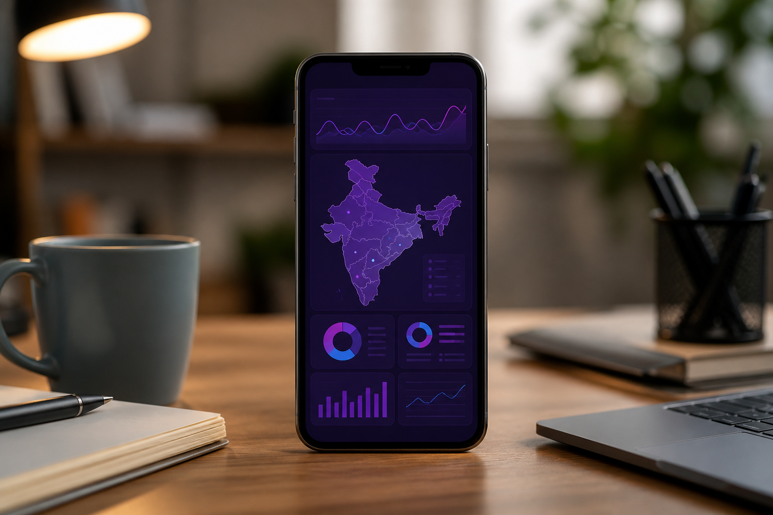
The lesson for Python visualisation: You would not build such a story with one chart. You would combine Seaborn-style exploration to find patterns, Matplotlib-style precision for polished report visuals and Plotly-style interactivity for maps, hover and drill-down.
Outcome or lesson: The strategic value was not “a nice dashboard.” It was making a complex Indian market visible at multiple levels - national, state, category and time. That is exactly what good visualisation should do: compress complexity without hiding the truth.
How AI Changes Visualisation in Python
AI is changing Python visualisation in three concrete ways.
- Natural-language chart generation: Tools can now convert prompts like “show monthly revenue by region as an interactive line chart” into Python code using pandas, Matplotlib, Seaborn or Plotly. This speeds up first drafts, but you still need to validate the chart choice and axis logic.
- Automated insight discovery: AI assistants can scan a dataset and suggest outliers, correlations, seasonality and segment differences. This is useful in EDA, but correlation and causation must still be judged by the analyst.
- Dashboard explanation and QA: LLMs can help write chart annotations, identify confusing labels, suggest better titles and flag whether a chart uses the wrong scale or too many colours.
Upload a cleaned CSV and your business question into ChatGPT or Claude. Ask: “Suggest the best chart types, write Python code using Seaborn and Plotly, and explain which chart I should present to a non-technical manager.” Then manually check the data types, aggregation logic, axis scale and business interpretation.
Interview Relevance
“You have customer transaction data in Python. When would you use Matplotlib, Seaborn and Plotly? Explain with examples.”
If asked to choose one library, do not blindly say Plotly because it is interactive. Say: “For exploratory statistical analysis I would start with Seaborn; for an executive report I would polish in Matplotlib; for a dashboard I would use Plotly.” That sounds like judgment, not tool-chasing.
Common Mistake
Candidates often recite library names without linking them to business questions. That costs them because the interviewer hears tool familiarity, not analytical thinking. One-line fix: always answer in this order - question → chart type → library → business decision.
What to Revise Next
Once visualisation is clear, move to the interpretation layer. Revise Statistical Analysis in Python and Reading the Output so you can explain what the chart is statistically suggesting, and then Python versus R versus SQL: Choosing the Right Tool so you can justify the broader analytics stack.