Best Tools for Data Visualization in Data Science
Data visualization, more often than not, is touted as the easiest task of data analytics as in this stage, all the data engineering activities such as data cleaning, extraction, transformation, loading, harmonization, etc. are done; and the cleaned data is hosted on data-lake for insight generation. This thought process, however, could be a hoax as this is the content that is the upper tip of the iceberg i.e. no matter how much hard work may have gone to collect, process & transform data; if it doesn’t look good – then the chances of the project getting rejected is high.
Hence, businesses generally put a lot of focus on data visualization, as the hard work put in all of the previous stages ultimately culminates in the design and orchestration of the report being designed and delivered. With this backdrop, the next sections would discuss the key tools & technology used for data visualization; and a logical comparison amongst them.
What are the different tools & techniques used for Data Visualization?
There is a multitude of visualization tools that are available in the market – each catering to certain business cases and bring invariably preferred in different domains & industry verticals. For example – businesses operating in the banking & financial services sector tend to put a lot of emphasis on SAS as a statistical analysis & visualization tool. In the same way, other product businesses & e-commerce companies tend to opt for Tableau, QlikView, PowerBI, etc. tools for effective front-end visualizations.
So, taking all of these possibilities into viewpoint, a few of the most frequently used and best tools for data visualization are mentioned below:
1. D3
D3, an acronym for ‘Data-Driven Documents’; is one of the most powerful tools in terms of the volume & variety of data that it can handle. Generally, D3 is used as a front-end visualization tool for large data systems such as Teradata.
2. HighCharts
Talking of visualization, JavaScript plays an important role in providing these services. HighCharts is an example of an elegant JavaScript library that is predominantly used to integrate & embed interactive charts to web applications
3. Echarts
Being a pure-play JavaScript platform, Echarts are mostly used for enterprise solutions; and is compatible with all devices & platforms.
4. Leaflet
Again, a JavaScript library used for visualization is specifically used for mobile applications. The leaflet is recommended for designing interactive maps in mobile applications.
5. Vega
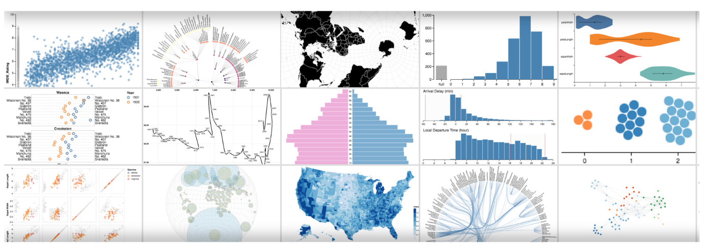
Also known as ‘Visualization Grammar’; Vega provides an extensive set of libraries and mapping APIs which can be used by developers to map diverse datasets to showcase interactive graphics. An indicative list of possible designs enabled by Vega is shown below –
- PowerBI – Being a Microsoft product, Power BI provides extremely extensive & rich features while retaining the simplicity of Excel. The tool extensively used in business organizations can connect to more than hundreds of data sources, transform data instantly, and provide rich visualization in no time. Power BI exists in both desktop as well as web versions – and the reports/dashboard built on it can be published as a service to end-users
- Tableau – Another frequently used visualization tool by business organizations, Tableau provides a rich platform to users to create interactive Power BI dashboards and data visualizations; and distribute them via publishing them. Like Power BI, Tableau also has a desktop version that can be used to work on standalone applications
- FineReport – This is a Java-based tool that is used for reporting for enterprise projects. This tool doesn’t require users to write a single line of code, and users can perform all steps from data entry to visualization using this tool itself.
What should be the governing factors for the selection of a Visualization Tool?
Although there are multiple visualization tools available in the market; there are no ‘one size suits all’ approach that is applicable here as different tools and technology have their own pros and cons. Still, a few of the factors which should be considered before choosing the best visualization tool for you:
- Intended stakeholders or users of the visualization – and the technical skill level of those users
- The existing technical infrastructure of the business specifically data infrastructure
- The volume of data that currently resides in the systems
- Levels of business customers i.e. whether the visualization would be directly catering to executive class; or whether there are any mid-level managers as well.