
Data Visualization with Python: Matplotlib, Seaborn, Plotly and Streamlit
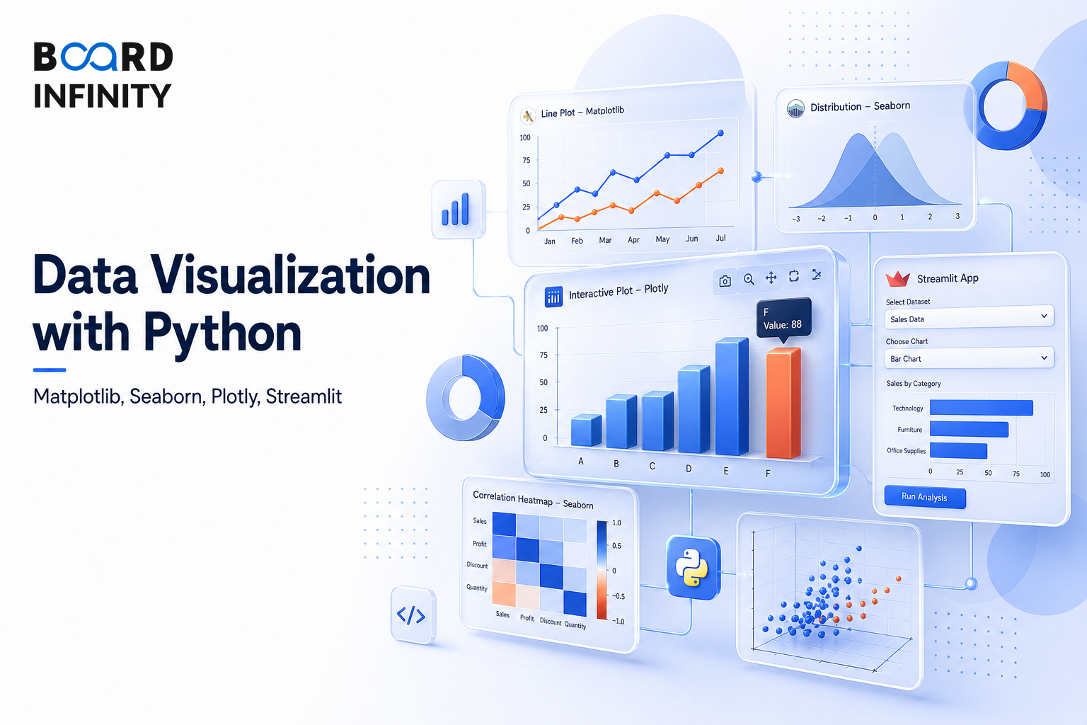
After Pandas for Data Manipulation, the next practical question is how to turn cleaned and analysed data into charts that support analysis and communication. Data Visualization with Python is mainly about choosing the right library for the use case, chart type, interactivity requirement, and learning curve. For placement prep, this matters because Python visualization choices often reveal whether you understand both analysis and business communication.
- Matplotlib is best for static, publication-quality, maximum customisation charts, with all standard types plus custom charts, no interactivity, and a high learning curve due to verbose syntax.
- Seaborn is best for statistical visualisation, exploratory data analysis, and beautiful defaults, with hist, KDE, box, violin, heatmap, pair, and regression charts.
- Plotly Express is best for interactive web-ready charts with minimal code, including all standard charts plus 3D, maps, and candlestick charts.
- Plotly Graph Objects is best for complex custom interactive charts with fully customisable traces, full interactivity, and a high learning curve because it is lower-level.
- Streamlit is best for rapid analytics web apps, integrates with all Python visualization libraries, provides a full web app experience, and has a low Python-native learning curve.
- Seaborn chart selection depends on the data situation: distribution, group comparison, relationships, correlation matrix, categorical versus numerical, pairwise relationships, category counts, or time series.
Big Picture: Choosing the Right Python Visualization Tool
The end-to-end Python analytics workflow is Raw Data, EDA, Cleaning, Feature Engineering, Analysis, Visualisation, and Communication. In that flow, Matplotlib and Seaborn support static visualization, Plotly supports interactive visualization, and Streamlit supports rapid analytics web apps.
Matplotlib, Seaborn, Plotly and Streamlit: When to Use Each
Matplotlib is the low-level, highly customisable static plotting option. It is best when you need static, publication-quality charts and fine-grained control over every element, but it has a high learning curve because of verbose syntax.
Seaborn is statistical visualisation built on Matplotlib. It is best for statistical visualisation, EDA, distribution plots, correlation matrices, regression plots, and beautiful defaults, with a low learning curve because it uses a high-level API.
Plotly Express is for interactive web-ready charts with minimal code. Its main advantage over Matplotlib for business dashboards is interactivity, especially hover, zoom, and filter.
Plotly Graph Objects is for complex custom interactive charts. It provides fully customisable traces and full interactivity, but has a high learning curve because it is lower-level.
Streamlit is for rapid analytics web apps. It is integrated with all Python visualization libraries, provides a full web app experience, and has a low Python-native learning curve.
Seaborn Plot Selection Guide
Seaborn is useful when the question is statistical visualization: distributions, comparisons, relationships, correlations, category counts, and time series. The chart choice should follow the data situation.
How to Read the Chart Selection Logic
If the task is a distribution of one numerical variable, use histplot() + kdeplot(). If the task is a distribution comparison across two or more groups, use boxplot() or violinplot().
If the task is the relationship between two numerical variables, use scatterplot() + regplot(). If the task is a correlation matrix of all numerical columns, use heatmap().
If the task is categorical versus numerical with one value per level, use barplot() or pointplot(). If the task is all pairwise relationships at once, use pairplot().
If the task is count of categories, use countplot(). If the task is a time series or line chart, use lineplot().
Static Charts vs Interactive Charts
Matplotlib and Seaborn are static visualization options. Matplotlib gives maximum customisation, while Seaborn gives beautiful defaults and a high-level API for statistical visualization.
Plotly Express and Plotly Graph Objects provide full interactivity. Plotly Express is lower effort and similar to Seaborn in learning curve, while Plotly Graph Objects is lower-level and suited to complex custom interactive charts.
Streamlit goes beyond a single chart by supporting rapid analytics web apps. It is integrated with all Python visualization libraries and provides a full web app experience.
Conclusion
The core choice in Python visualization is simple: use Matplotlib for static publication-quality customisation, Seaborn for statistical visualization and EDA, Plotly for interactive web-ready charts, and Streamlit for rapid analytics web apps. The best answer is not a single library - it is matching the library and chart type to the data situation, interactivity requirement, and learning curve.
The common mistake is choosing a library without matching it to the use case. For business dashboards, the main advantage of Plotly over Matplotlib is that Plotly charts are interactive with hover, zoom, and filter, while Matplotlib and Seaborn are static.