How to add a space between the flex container and its elements?
There exists a CSS layout for the development of layouts that can stretch and shrink, depending on the available screen or a device’s space, known as Flexbox or the Flexible Box Layout. This flexbox layout method was first proposed in 2009 and became a first-class W3C recommendation in 2017 and can be defined as a muscle organized for happier and more efficient ways of arranging objects in a given space while simultaneously guaranteeing a better distribution of unknown or variable size of objects in a container.
About Flex Container & Flex Items
Before we delve into adding flex space between the container and its elements, it's essential to understand the basic concepts of Flexbox:
- Flex Container: The container element into which the flex items are placed. It is set by the display property adopted as either flex or inline-flex.
- Flex Items: The flex item is defined as the child elements inside of them from the flex container.
Here's a simple example of a flex container with flex items:
html
<div class="flex-container">
    <div class="flex-item">Item 1</div>
    <div class="flex-item">Item 2</div>
    <div class="flex-item">Item 3</div>
</div>

css
.flex-container {
    display: flex;
    border: 1px solid #000;
}

.flex-item {
    padding: 10px;
    border: 1px solid #ccc;
}
Techniques to Place Flex Space between the Container and the Flex Items
It is possible to create flex space between the container and its elements, which are presented in several types. Now let's understand the methods in detail.
Using margin
The margin property is one of the easiest methods that are used by designers to place space all around the flex container or container’s children. By using a margin on the flex items, space is made around them.
css
.flex-item {
    margin: 10px;
}
In this instance, the adding of margin to the .flex-item class helps to separate flex items from each other as well as giving a buffer from the flex container borders.
Using padding
The padding property offers space within the flex container surrounding its overall border. It could also be used when you need space and that space is to be created within the container itself.
.flex-container {
    display: flex;
    padding: 10px;
    border: 1px solid #000;
}
Applying padding on the .flex-container gives some space within the container, making the content not stick closely on the edges, which helps in coming up with decent designs.
Using gap
Again the gap property which has grid-gap when used with CSS Grid is used in creating flex spaces between items. However, it does not place flex space between the container and the items within the same container. It is useful to control the spacing inside of an item; that is, the distance between items that have to be placed on a page.
css
.flex-container {
    display: flex;
    gap: 10px;
    border: 1px solid #000;
}
As stated above the gap property does not put flex space between the flex container and its items rather it controls the gap that is in between the items and because of this it is one of the most useful tools in layout design.
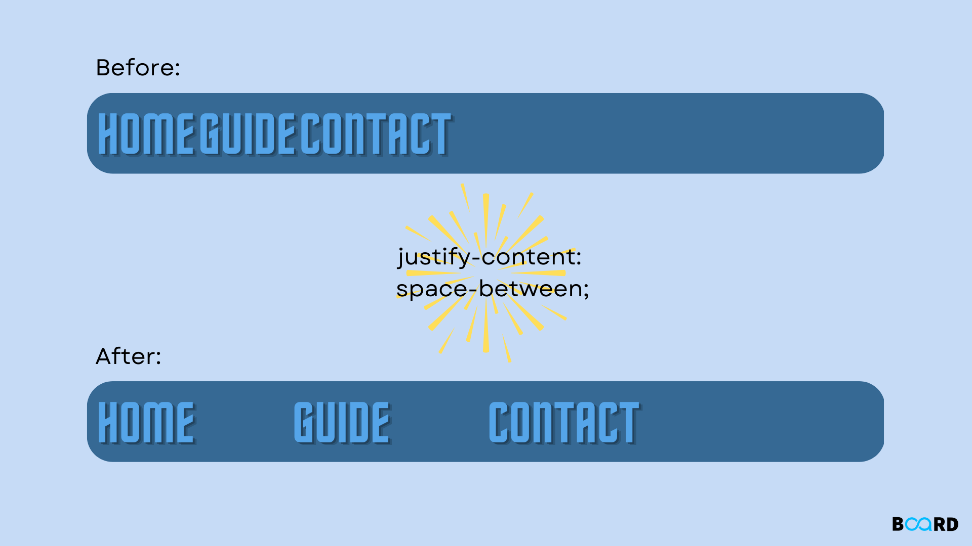
Using justify-content
The justify-content property is used to give the space on the main axis using center, flex-start, flex-end, or flex space between the flex items. It can also find use in providing the required space around the flex items.
.flex-container {
    display: flex;
    justify-content: space-between;
    border: 1px solid #000;
}
Using justify-content: space-between; it places flex space between the items, and when used in conjunction with other properties, it can actually influence the space around the items also.
Using align-items
The align-items property causes the flex items to be stretched and placed in the cross axes. They can be combined collectively with other properties to obtain the requisite spacing impact.
.flex-container {
    display: flex;
    align-items: center;
    border: 1px solid #000;
}
Using align-items alongside with other Flexbox properties will also reach the overall harmonious and attractive design solution.
Practical Examples
Let's discuss some examples for a better understanding of how all these methods may be used.
Example 1: Using Margin
html
<div class="flex-container">
    <div class="flex-item">Item 1</div>
    <div class="flex-item">Item 2</div>
    <div class="flex-item">Item 3</div>
</div>

css
.flex-container {
    display: flex;
    border: 1px solid #000;
}

.flex-item {
    margin: 10px;
    padding: 10px;
    border: 1px solid #ccc;
}
In this example, the margin set for flex items is 10px; it provides space for each item and does not let it come close to the container.
Example 2: Using Padding
html
<div class="flex-container">
    <div class="flex-item">Item 1</div>
    <div class="flex-item">Item 2</div>
    <div class="flex-item">Item 3</div>
</div>

css
.flex-container {
    display: flex;
    padding: 10px;
    border: 1px solid #000;
}

.flex-item {
    padding: 10px;
    border: 1px solid #ccc;
}
In this example, the flex container has a padding of 10px, creating space inside the container and pushing the items away from the edges.
Example 3: Combining Methods
You can also combine multiple methods to achieve more complex layouts:
html
<div class="flex-container">
    <div class="flex-item">Item 1</div>
    <div class="flex-item">Item 2</div>
    <div class="flex-item">Item 3</div>
</div>

css
.flex-container {
    display: flex;
    padding: 20px;
    gap: 10px;
    border: 1px solid #000;
}

.flex-item {
    margin: 5px;
    padding: 10px;
    border: 1px solid #ccc;
}
In this example, the container has padding and a gap between items, the items themselves being the margin. This combination guarantees reasonable separation both within the container and between the items.
Advanced Techniques for Space Management in Flexbox
For those looking to take their Flexbox layouts to the next level, here are some advanced techniques for managing space effectively:
Using calc() for Dynamic Spacing
One example of such an approach is the usage of the calc() function in CSS that allows to have more flexible margins in regards to viewport width or other similar properties.
.flex-container {
    display: flex;
    padding: calc(1% + 10px);
    border: 1px solid #000;
}
This is useful in this example as padding depends on the viewport and will change if the website is viewed on a laptop as opposed to a mobile device.
Flexbox with Media Queries
When used in conjunction with the aid of media queries, Flexbox can be used to create more designs that will suit different screen sizes.
css
.flex-container {
    display: flex;
    padding: 10px;
    border: 1px solid #000;
}

@media (max-width: 600px) {
    .flex-container {
        flex-direction: column;
        padding: 5px;
    }
}
In this example, the flex container switches to a column arrangement, but with less padding, it is perfect when viewed on mobile devices.
Nested Flex Containers
Additional control of nested structures might be achieved through the use of nested flex containers.
html
<div class="outer-container">
    <div class="inner-container">
        <div class="flex-item">Item 1</div>
        <div class="flex-item">Item 2</div>
        <div class="flex-item">Item 3</div>
    </div>

css
.outer-container {
    display: flex;
    justify-content: center;
    padding: 20px;
    border: 1px solid #000;
}

.inner-container {
    display: flex;
    gap: 10px;
    padding: 10px;
    border: 1px solid #ccc;
}

.flex-item {
    padding: 10px;
    border: 1px solid #ccc;
}
Here the .outer-container and .inner-container combine to provide some measure of spacing control, and all the flex items have padding and borders for more spacing and styling.