Graph Plotting in Python

Introduction
Python has the ability to create graphs by using the matplotlib library. It has numerous packages and functions which generate a wide variety of graphs and plots. It is also very simple to use. It along with numpy and other python built-in functions achieves the goal. In this article we will see some of the different kinds of graphs it can generate.
Line Graph
To create a line graph using Matplotlib, it’s as simple as just declaring the x-axis and y-axis values attribute in the exact order within the plt.plot function.
Basically the plt.plot function in its default state draws a line from point to point, so it automatically recognises data as a line graph.
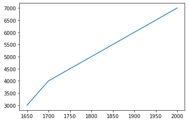
As shown above, its quite simple to plot a line graph, where we just declared the x-axis as the year and our GDP value as the y axis.
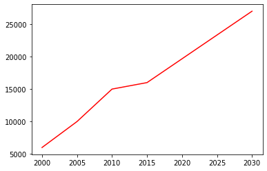
Colored Line Graph
Matplotlib plot function also provides the ability to change the color of your line graph.
To change the color of your line graph, you can simply use the attribute color within your plt.plot() function and declare the relevant colors.
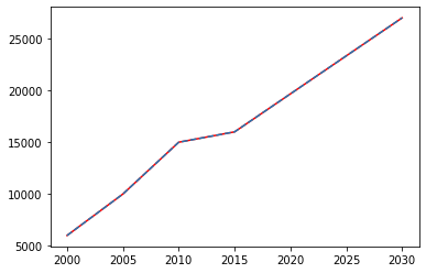
Dotted Line Graph
Since in the default state matplotlib’s plt.plot draws graphs by connecting datapoints together.
An option that matplotlib provides is the ability to change the style of your lines.
To create a dotted or dashed line graph in matplotlib we can use the attribute linestyle within matplotlib’s line graph plot function and declare it as dashed.
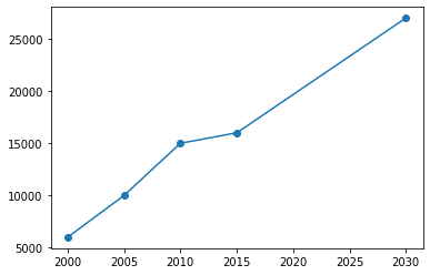
Marked Line Graph
Using markers is a great way to show the volatility or changes from one dot point to another.
To create markers on our line graph, we can use the attribute marker within matplotlib’s line graph plot function and input the value as o.
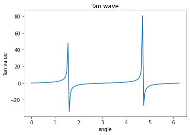
Simple Graphs
Here we take a mathematical function to generate the x and Y coordinates of the graph. Then we use matplotlib to plot the graph for that function. Here we can apply labels and show the title of the graph as shown below. We are plotting the graph for the trigonometric function − tan.
Example
Output
Running the above code gives us the following result −
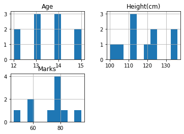
Histogram in Python
The histogram is used to find the frequency of occurrence of values in defined intervals. Let us create a data frame and plot the histogram of different numerical columns just by using a few lines of code.
Example of a histogram:
Output:
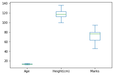
Box Plot Chart in Python
A box plot is used to represent statistical data graphically based on the minimum, maximum, first quartile, median, and third quartile. The graph looks similar to a rectangle with lines extending from the top and bottom. So the name box plot. Let us see the box plot for the above created data frame.
Example of a box plot:
Output:
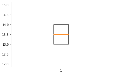
We can also plot for one of the columns as shown in the below example.
Example of a box plot for one of the columns:
Output:
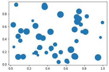
Bubble Chart in Python
A bubble chart is like a scatter plot with another dimension. In this larger bubbles represent larger values. Let us see an example.
Example of a bubble chart:
Output:
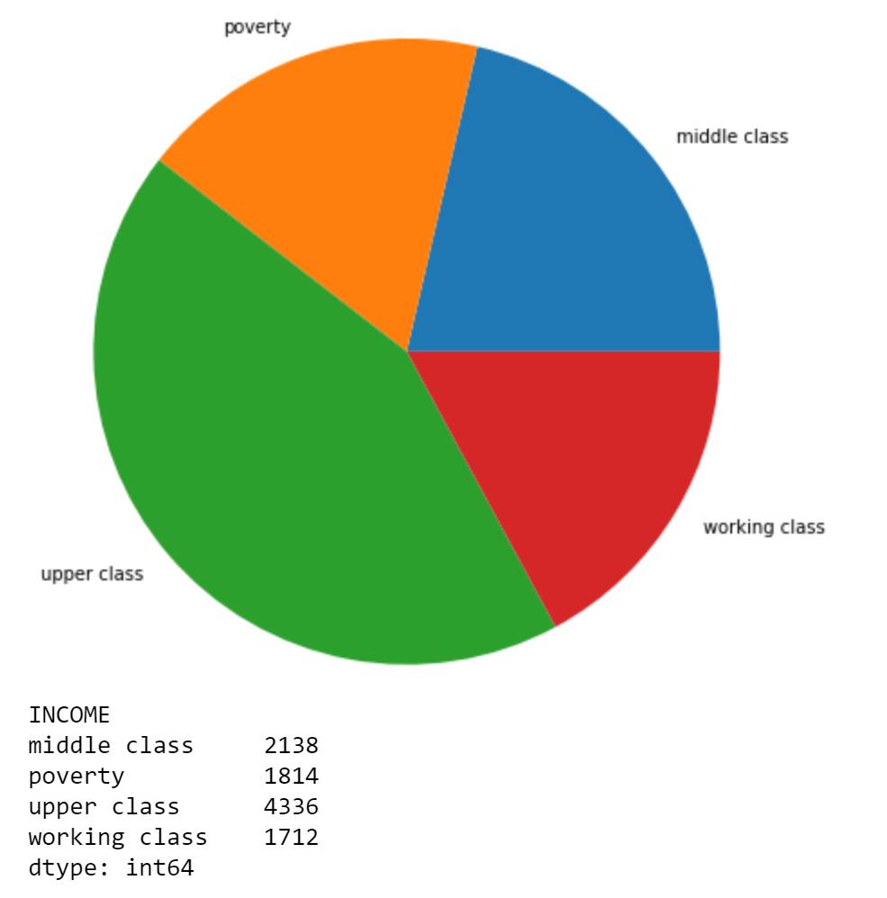
Pie Chart
Matpotlib allows you to display a pie chart once you have declared all the necessary values and the corresponding labels.
To graph our pie chart we need to first import our data which I have done via the panda’s data library “read_csv” function.
Afterward, we need to manipulate our data to count the frequency of the unique attributes within our “INCOME” column, this can be done by using the dataframe’s function “value_counts()” to count the frequency.
We also need to create our labels.
This can be completed using the function “unique().tolist()” to identify the unique values within the “INCOME” column..
Conclusion
In this article, we gave an overview of Graph Plotting in Python and discussed how to create Line Charts, Bar Graphs, Histograms, Box Plot and Bubble charts using various data visualization packages offered by Python like Matplotlib and Seaborn.